I've lately been looking a lot at the CD designs I made for my sister's wedding to see what kind of improvements I could make and thought I'd make the composition of the back cover make more sense. There were small things I wanted to fix so I deciced to change 'em real quick and thought I'd share what I've done.
*ORIGINAL*
In the original picture I found that the larger text (the list of songs) were really small and all cramped together. The CD covers were trimmed into their 4.75" x 4.75" size, which is pretty small so I don't think the text would have read too well. I never tested it out, but I've seen a CD cover in that size and thought I made the text too small and too cramped together for that particular size.
*IMPROVEMENTS MADE*
So what I did was strectch down the text more to make it seem bigger and less cramped. I moved the black area of the background down a bit and nudged the text around for it to fit nicely in that area. I then shrunk down a bit the caricatures with the word bubbles to give more focus to the text. I noticed I could've made the area with the caricatures and word bubbles smaller to put more emphasis on the text, but then I would've made the text inside the word bubbles too small, considering the size of paper it is going to be printed on, and it might also make the whole composition feel a little out of balance.
You can flip them back and forth with the arrow keys to see the before and after. You can do so with the new image viewer thing from Blogger.
Doing this really helps me remind myself that the elements in a composition should make sense with not only what they are subjectively, but how they are placed and work together in the composition in a way that they can make sense together and read well as well as look visually interesting, appealing and balanced as a whole for the viewer.
This excercise also helps me see how I myself work and start on something, particularly with figuring out the composition first and spacing of where and why things will be placed in the picture in a way where sense can be made instead of going into it without actually thinking too much about the whole thing, which I hope to never do again. This I think can help me apply what I've learned here into another new illustration.
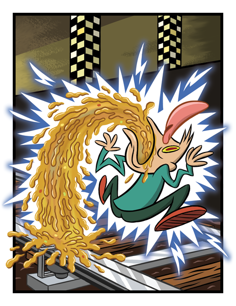
There's other things in the back cover I'd like to fix, like the dude's head seeming a bit wonky for example, but I wanted to focus more on composition for this one.
The purpose of doing this was to not make the picture be all perfect, but to understand exactly what I'm doing as I'm working on a picture so that the entire thing can make sense for me as well as the viewer.